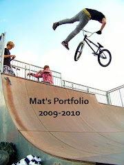
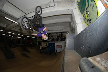
 Evaluation: This is our magazine. We tried to use as many conventions as possible when making the magazine. So that it would be to our best standard. One convention that you can is our colour pallet, we choose to use as the main colours red and white. We choose these colours because it would suit our audience best, because it is a sport magazine and would mainly be aimed at boys and the colour red is seen to be a more of a boy colour than pink for example. Secondly we made the magazine as eye catching as possible, we did this by putting the main picture in the centre of the magazine and making it very big, also the title is very eye catching because it is centred and at the top so it is the first tthing the audince/reader will read.
To conclude are magazine i think we have done a quite good job and stayed within the conventions of a magazine. But we did have a few problems with Photoshop making it, but we shall learn from our mistakes in future tasks.
No comments:
Post a Comment